ggraph 可用于 网络、图和树状 数据结构的可视化。它扩展了 ggplot2 的 geoms,facets 等功能,并且添加了对 layouts 语法的支持。
先看一个简单的例子。
library(ggraph)
## Loading required package: ggplot2
library(tidygraph)
##
## Attaching package: 'tidygraph'
## The following object is masked from 'package:stats':
##
##     filter
# Create graph of highschool friendships
graph <- as_tbl_graph(highschool) %>%
    mutate(Popularity = centrality_degree(mode = 'in'))
这个数据(highschool)包含了学校成员之间的联系。第一列是一个人(from),第二列是另一个人(to),第三列是这个连接(edge)的属性。
highschool
##     from to year
## 1      1 14 1957
## 2      1 15 1957
## 3      1 21 1957
## 4      1 54 1957
## 5      1 55 1957
## 6      2 21 1957
## 7      2 22 1957
## 8      3  9 1957
## 9      3 15 1957
## 10     4  5 1957
## 11     4 18 1957
## 12     4 19 1957
## 13     4 43 1957
## 14     5 19 1957
## 15     5 43 1957
## 16     6 13 1957
## 17     6 20 1957
## 18     6 22 1957
## 19     7 17 1957
## 20     8 14 1957
## 21     8 17 1957
## 22     9 12 1957
## 23     9 20 1957
## 24     9 21 1957
## 25     9 22 1957
## 26     9 51 1957
## 27    11 19 1957
## 28    11 50 1957
## 29    11 52 1957
## 30    11 53 1957
## 31    12 20 1957
## 32    12 21 1957
## 33    12 22 1957
## 34    13 17 1957
## 35    13 20 1957
## 36    13 21 1957
## 37    13 22 1957
## 38    14 21 1957
## 39    14 22 1957
## 40    15 20 1957
## 41    16 18 1957
## 42    16 41 1957
## 43    16 43 1957
## 44    17  7 1957
## 45    17  8 1957
## 46    18 11 1957
## 47    18 16 1957
## 48    18 19 1957
## 49    19  4 1957
## 50    19 11 1957
## 51    19 16 1957
## 52    19 18 1957
## 53    19 27 1957
## 54    20  6 1957
## 55    20 12 1957
## 56    20 21 1957
## 57    20 22 1957
## 58    20 38 1957
## 59    21 22 1957
## 60    21 51 1957
## 61    21 54 1957
## 62    21 55 1957
## 63    22 20 1957
## 64    22 21 1957
## 65    22 38 1957
## 66    22 51 1957
## 67    23 40 1957
## 68    23 43 1957
## 69    23 50 1957
## 70    23 52 1957
## 71    23 53 1957
## 72    23 60 1957
## 73    23 62 1957
## 74    23 65 1957
## 75    23 68 1957
## 76    24 51 1957
## 77    26 32 1957
## 78    26 35 1957
## 79    26 36 1957
## 80    26 40 1957
## 81    26 41 1957
## 82    26 42 1957
## 83    27 18 1957
## 84    27 37 1957
## 85    27 40 1957
## 86    28 38 1957
## 87    28 39 1957
## 88    29 13 1957
## 89    29 38 1957
## 90    30 35 1957
## 91    30 48 1957
## 92    31 10 1957
## 93    31 37 1957
## 94    31 40 1957
## 95    32 26 1957
## 96    32 33 1957
## 97    32 43 1957
## 98    32 62 1957
## 99    33 36 1957
## 100   33 41 1957
## 101   33 42 1957
## 102   33 43 1957
## 103   34 39 1957
## 104   34 46 1957
## 105   35 30 1957
## 106   35 48 1957
## 107   36 32 1957
## 108   36 33 1957
## 109   36 42 1957
## 110   36 43 1957
## 111   37 31 1957
## 112   37 40 1957
## 113   38 21 1957
## 114   38 22 1957
## 115   38 51 1957
## 116   38 55 1957
## 117   39 28 1957
## 118   39 29 1957
## 119   39 34 1957
## 120   39 46 1957
## 121   39 59 1957
## 122   40 35 1957
## 123   40 37 1957
## 124   41 16 1957
## 125   41 42 1957
## 126   41 43 1957
## 127   41 68 1957
## 128   42 36 1957
## 129   42 41 1957
## 130   42 43 1957
## 131   42 68 1957
## 132   43 41 1957
## 133   43 42 1957
## 134   43 68 1957
## 135   44 47 1957
## 136   45 49 1957
## 137   45 54 1957
## 138   45 55 1957
## 139   45 57 1957
## 140   45 70 1957
## 141   46 34 1957
## 142   46 39 1957
## 143   46 54 1957
## 144   46 59 1957
## 145   47 44 1957
## 146   47 48 1957
## 147   47 52 1957
## 148   47 53 1957
## 149   48 30 1957
## 150   48 50 1957
## 151   48 52 1957
## 152   48 53 1957
## 153   49 54 1957
## 154   49 55 1957
## 155   49 70 1957
## 156   49 71 1957
## 157   50 47 1957
## 158   50 52 1957
## 159   50 53 1957
## 160   50 68 1957
## 161   51 21 1957
## 162   51 22 1957
## 163   51 70 1957
## 164   52 47 1957
## 165   52 48 1957
## 166   52 50 1957
## 167   52 53 1957
## 168   52 68 1957
## 169   53 50 1957
## 170   53 52 1957
## 171   54 45 1957
## 172   54 49 1957
## 173   54 55 1957
## 174   54 63 1957
## 175   54 69 1957
## 176   54 71 1957
## 177   55 45 1957
## 178   55 49 1957
## 179   55 54 1957
## 180   56 64 1957
## 181   56 70 1957
## 182   56 71 1957
## 183   57 45 1957
## 184   57 49 1957
## 185   57 55 1957
## 186   57 66 1957
## 187   57 70 1957
## 188   57 71 1957
## 189   58 61 1957
## 190   58 65 1957
## 191   59 39 1957
## 192   59 54 1957
## 193   59 55 1957
## 194   60 58 1957
## 195   60 61 1957
## 196   60 62 1957
## 197   60 65 1957
## 198   61 58 1957
## 199   61 65 1957
## 200   62 60 1957
## 201   62 65 1957
## 202   63 66 1957
## 203   63 67 1957
## 204   63 69 1957
## 205   63 70 1957
## 206   63 71 1957
## 207   64 66 1957
## 208   64 67 1957
## 209   64 69 1957
## 210   64 71 1957
## 211   65 60 1957
## 212   65 62 1957
## 213   65 68 1957
## 214   66 64 1957
## 215   66 67 1957
## 216   66 69 1957
## 217   66 70 1957
## 218   66 71 1957
## 219   67 63 1957
## 220   67 64 1957
## 221   67 66 1957
## 222   67 69 1957
## 223   67 71 1957
## 224   68 31 1957
## 225   68 61 1957
## 226   68 62 1957
## 227   68 65 1957
## 228   69 63 1957
## 229   69 64 1957
## 230   69 66 1957
## 231   69 67 1957
## 232   69 71 1957
## 233   70 63 1957
## 234   70 66 1957
## 235   70 67 1957
## 236   70 69 1957
## 237   70 71 1957
## 238   71 63 1957
## 239   71 64 1957
## 240   71 66 1957
## 241   71 67 1957
## 242   71 69 1957
## 243   71 70 1957
## 244    1 15 1958
## 245    1 21 1958
## 246    1 22 1958
## 247    2  9 1958
## 248    2 22 1958
## 249    4  5 1958
## 250    4 11 1958
## 251    4 16 1958
## 252    4 19 1958
## 253    4 43 1958
## 254    5  4 1958
## 255    5 19 1958
## 256    5 43 1958
## 257    6  8 1958
## 258    6 13 1958
## 259    6 17 1958
## 260    6 20 1958
## 261    6 29 1958
## 262    7 13 1958
## 263    7 17 1958
## 264    7 21 1958
## 265    8 13 1958
## 266    8 14 1958
## 267    8 28 1958
## 268    9 20 1958
## 269    9 21 1958
## 270    9 22 1958
## 271    9 70 1958
## 272   10 18 1958
## 273   10 19 1958
## 274   11  4 1958
## 275   11 16 1958
## 276   11 19 1958
## 277   11 33 1958
## 278   11 42 1958
## 279   12 20 1958
## 280   12 21 1958
## 281   12 22 1958
## 282   13  5 1958
## 283   13  6 1958
## 284   13 17 1958
## 285   13 20 1958
## 286   13 22 1958
## 287   14 13 1958
## 288   14 22 1958
## 289   15  1 1958
## 290   15 12 1958
## 291   15 20 1958
## 292   15 21 1958
## 293   16 41 1958
## 294   16 62 1958
## 295   16 68 1958
## 296   17  1 1958
## 297   17  7 1958
## 298   17  8 1958
## 299   17 13 1958
## 300   17 22 1958
## 301   18 19 1958
## 302   19  4 1958
## 303   19  5 1958
## 304   19  9 1958
## 305   19 11 1958
## 306   19 12 1958
## 307   20  9 1958
## 308   20 12 1958
## 309   20 19 1958
## 310   20 21 1958
## 311   20 22 1958
## 312   21 20 1958
## 313   21 22 1958
## 314   21 38 1958
## 315   21 51 1958
## 316   21 55 1958
## 317   22 20 1958
## 318   22 21 1958
## 319   22 28 1958
## 320   22 38 1958
## 321   22 51 1958
## 322   23 52 1958
## 323   23 53 1958
## 324   23 63 1958
## 325   23 69 1958
## 326   23 71 1958
## 327   24 28 1958
## 328   26 30 1958
## 329   26 32 1958
## 330   26 34 1958
## 331   26 36 1958
## 332   26 39 1958
## 333   27  5 1958
## 334   27 35 1958
## 335   27 37 1958
## 336   27 40 1958
## 337   27 43 1958
## 338   28 22 1958
## 339   28 38 1958
## 340   28 39 1958
## 341   29 33 1958
## 342   29 36 1958
## 343   29 42 1958
## 344   30 35 1958
## 345   30 37 1958
## 346   31 23 1958
## 347   31 37 1958
## 348   31 40 1958
## 349   31 50 1958
## 350   32 29 1958
## 351   32 33 1958
## 352   32 36 1958
## 353   32 38 1958
## 354   32 39 1958
## 355   32 43 1958
## 356   33 36 1958
## 357   33 41 1958
## 358   33 42 1958
## 359   33 43 1958
## 360   34 46 1958
## 361   36 29 1958
## 362   36 33 1958
## 363   36 41 1958
## 364   36 42 1958
## 365   36 43 1958
## 366   37 27 1958
## 367   37 30 1958
## 368   37 40 1958
## 369   38 21 1958
## 370   38 22 1958
## 371   38 28 1958
## 372   38 39 1958
## 373   39 28 1958
## 374   39 38 1958
## 375   39 46 1958
## 376   39 59 1958
## 377   39 70 1958
## 378   40 27 1958
## 379   40 30 1958
## 380   40 37 1958
## 381   41 16 1958
## 382   41 33 1958
## 383   41 42 1958
## 384   41 43 1958
## 385   41 68 1958
## 386   42 29 1958
## 387   42 41 1958
## 388   42 43 1958
## 389   43 33 1958
## 390   43 41 1958
## 391   43 42 1958
## 392   43 68 1958
## 393   44 47 1958
## 394   44 50 1958
## 395   45 49 1958
## 396   45 51 1958
## 397   45 54 1958
## 398   45 55 1958
## 399   45 57 1958
## 400   46 39 1958
## 401   46 49 1958
## 402   46 51 1958
## 403   46 54 1958
## 404   46 55 1958
## 405   47 52 1958
## 406   48 45 1958
## 407   48 49 1958
## 408   48 51 1958
## 409   48 54 1958
## 410   48 55 1958
## 411   49 47 1958
## 412   49 51 1958
## 413   49 52 1958
## 414   49 53 1958
## 415   49 55 1958
## 416   50 23 1958
## 417   50 52 1958
## 418   50 53 1958
## 419   51 21 1958
## 420   51 45 1958
## 421   51 48 1958
## 422   51 54 1958
## 423   51 55 1958
## 424   52 49 1958
## 425   52 53 1958
## 426   52 55 1958
## 427   53 52 1958
## 428   53 55 1958
## 429   53 63 1958
## 430   53 70 1958
## 431   54 45 1958
## 432   54 49 1958
## 433   54 51 1958
## 434   54 55 1958
## 435   54 70 1958
## 436   55 45 1958
## 437   55 49 1958
## 438   55 52 1958
## 439   55 53 1958
## 440   55 54 1958
## 441   56 62 1958
## 442   56 67 1958
## 443   56 68 1958
## 444   56 70 1958
## 445   56 71 1958
## 446   57 49 1958
## 447   57 51 1958
## 448   57 66 1958
## 449   57 70 1958
## 450   58 61 1958
## 451   58 65 1958
## 452   59 39 1958
## 453   59 48 1958
## 454   59 49 1958
## 455   59 56 1958
## 456   59 68 1958
## 457   60 58 1958
## 458   60 61 1958
## 459   60 62 1958
## 460   60 70 1958
## 461   60 71 1958
## 462   61 58 1958
## 463   61 65 1958
## 464   61 66 1958
## 465   62 60 1958
## 466   62 70 1958
## 467   63 66 1958
## 468   63 67 1958
## 469   63 69 1958
## 470   63 70 1958
## 471   63 71 1958
## 472   64 66 1958
## 473   64 70 1958
## 474   64 71 1958
## 475   65 67 1958
## 476   65 68 1958
## 477   65 70 1958
## 478   65 71 1958
## 479   66 63 1958
## 480   66 64 1958
## 481   66 67 1958
## 482   66 70 1958
## 483   66 71 1958
## 484   67 60 1958
## 485   67 63 1958
## 486   67 66 1958
## 487   67 70 1958
## 488   67 71 1958
## 489   68 62 1958
## 490   68 70 1958
## 491   68 71 1958
## 492   69 63 1958
## 493   69 64 1958
## 494   69 66 1958
## 495   69 67 1958
## 496   69 71 1958
## 497   70 63 1958
## 498   70 66 1958
## 499   70 67 1958
## 500   70 69 1958
## 501   70 71 1958
## 502   71 56 1958
## 503   71 62 1958
## 504   71 66 1958
## 505   71 67 1958
## 506   71 70 1958
在生成图(graph)之后,计算了节点(node)的 centrality。
graph
## # A tbl_graph: 70 nodes and 506 edges
## #
## # A directed multigraph with 1 component
## #
## # Node Data: 70 × 1 (active)
##    Popularity
##         <dbl>
##  1          2
##  2          0
##  3          0
##  4          4
##  5          5
##  6          2
##  7          2
##  8          3
##  9          4
## 10          4
## # ℹ 60 more rows
## #
## # Edge Data: 506 × 3
##    from    to  year
##   <int> <int> <dbl>
## 1     1    13  1957
## 2     1    14  1957
## 3     1    20  1957
## # ℹ 503 more rows
这样的一个 graph 含有 70 个节点,506 条边,是一个有向图(directed)。Node 的属性 Popularity 是刚刚上面计算的,edge 的属性是 highschool 数据框本来就有的。
使用 ggraph 等函数可以将这个一个图可视化。
# plot using ggraph
ggraph(graph, layout = 'kk') +
    geom_edge_fan(aes(alpha = stat(index)), show.legend = FALSE) +
    geom_node_point(aes(size = Popularity)) +
    facet_edges(~year) +
    theme_graph(foreground = 'steelblue', fg_text_colour = 'white')
## Warning: `stat(index)` was deprecated in ggplot2 3.4.0.
## ℹ Please use `after_stat(index)` instead.
## This warning is displayed once every 8 hours.
## Call `lifecycle::last_lifecycle_warnings()` to see where this warning was
## generated.
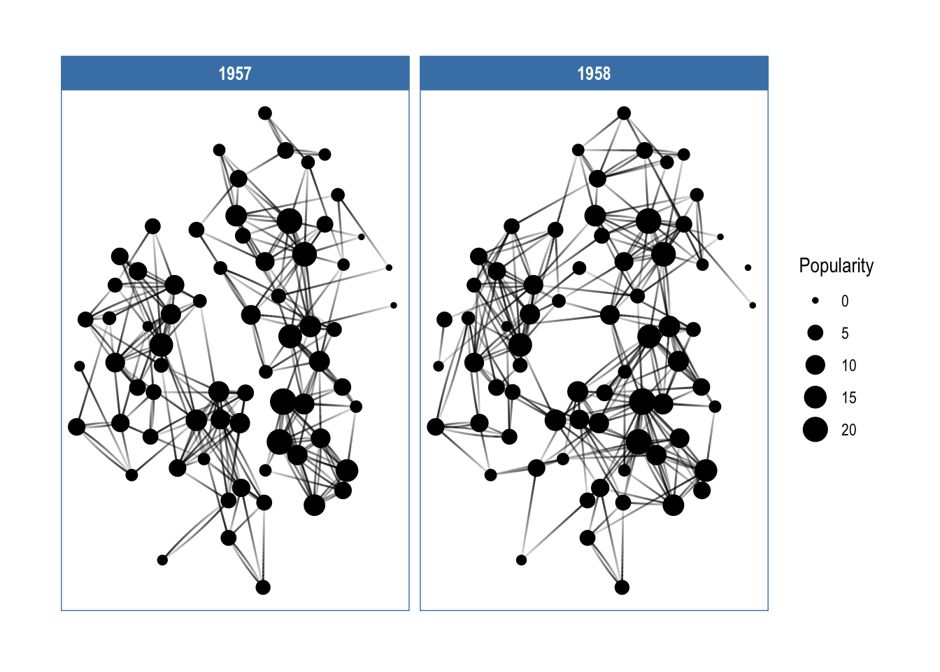
在这里,分两年显示了学生间的亲密关系,与更多人有联系的同学受欢迎程度更大(Popularity),其节点的大小越大。
核心概念
- 布局(The Layouts):定义节点的位置,本质上给出了每个节点在图上的
x,y坐标。ggraph在igraph原有的布局函数上,又添加了一些(如 hive plots,treemaps 和 circle packing)。 - 节点(The Nodes):图上的节点。使用
geom_node_*()函数家族可视化。一些 geoms 适用于特定布局(如geom_node_tile()适用于 treemaps 和 icicle 图形),而另外一些则具有普适性(如geom_node_point()。 - 边(The Edges):是节点之间的连线。使用
geom_edge_*()函数家族可视化,不同的场景下会有不同的边的类型。
Layouts
Source: vignettes/Layouts.Rmd
布局的本质是坐标系中的位置。布局函数所做的事情就是接受一个图的数据结构的输入,计算后输出 xy 坐标。
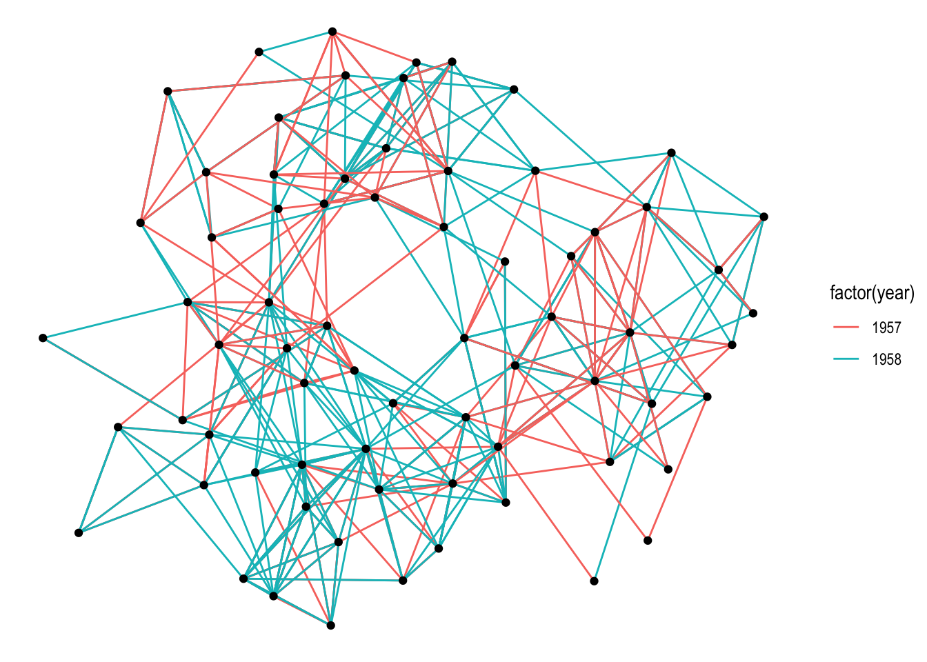
默认情况下,会调用 auto 布局。
set_graph_style(plot_margin = margin(1,1,1,1))
graph <- as_tbl_graph(highschool)

# Not specifying the layout - defaults to "auto"
ggraph(graph) +
  geom_edge_link(aes(colour = factor(year))) +
  geom_node_point()
## Using "stress" as default layout
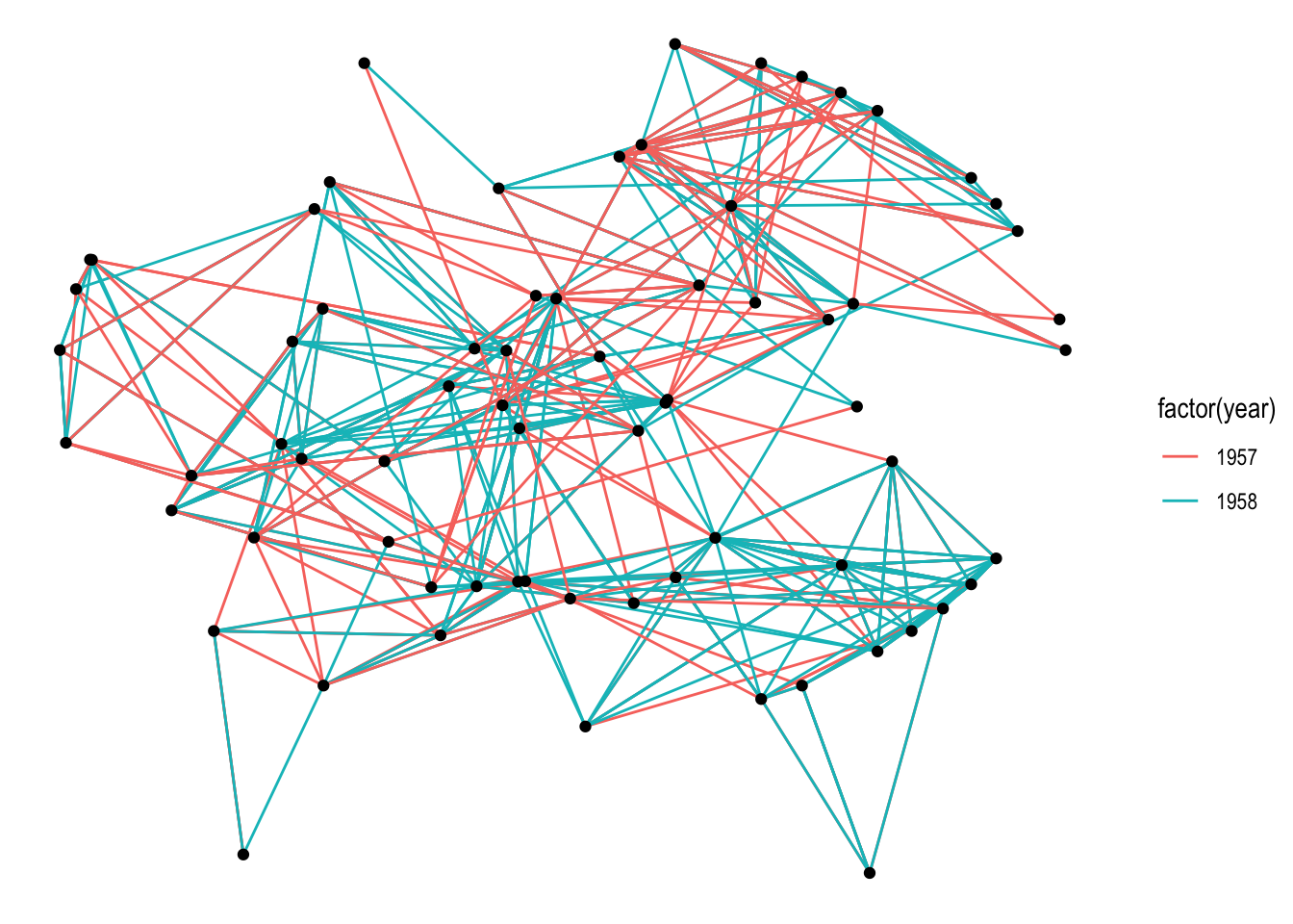
在 ggraph() 指定布局的同时还可以添加参数。
ggraph(graph, layout = 'kk', maxiter = 100) +
  geom_edge_link(aes(colour = factor(year))) +
  geom_node_point()
ggraph() 也可以使用预先计算好的布局。这在自定义布局的时候很有用。
layout <- create_layout(graph, layout = 'eigen')
## Warning in layout_with_eigen(graph, type = type, ev = eigenvector): g is
## directed. undirected version is used for the layout.
ggraph(layout) +
  geom_edge_link(aes(colour = factor(year))) +
  geom_node_point()
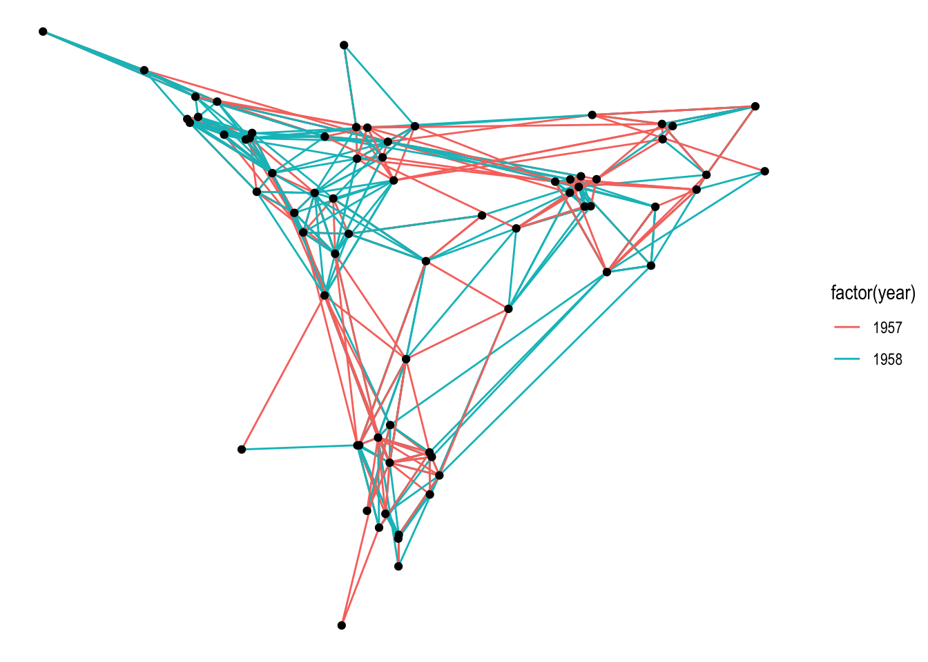
creat_layout() 的结果是一个数据框,包括 node 的位置和属性。当然,图的其它信息也包含在其中。
head(layout)
## # A tibble: 6 × 5
##          x       y circular .ggraph.orig_index .ggraph.index
##      <dbl>   <dbl> <lgl>                 <int>         <int>
## 1 -0.0447  -0.156  FALSE                     1             1
## 2 -0.0374  -0.208  FALSE                     2             2
## 3 -0.0565  -0.299  FALSE                     3             3
## 4  0.180    0.0348 FALSE                     4             4
## 5  0.177   -0.0122 FALSE                     5             5
## 6  0.00998 -0.195  FALSE                     6             6
attributes(layout)
## $names
## [1] "x"                  "y"                  "circular"
## [4] ".ggraph.orig_index" ".ggraph.index"
##
## $row.names
##  [1]  1  2  3  4  5  6  7  8  9 10 11 12 13 14 15 16 17 18 19 20 21 22 23 24 25
## [26] 26 27 28 29 30 31 32 33 34 35 36 37 38 39 40 41 42 43 44 45 46 47 48 49 50
## [51] 51 52 53 54 55 56 57 58 59 60 61 62 63 64 65 66 67 68 69 70
##
## $class
## [1] "layout_tbl_graph" "layout_ggraph"    "tbl_df"           "tbl"
## [5] "data.frame"
##
## $graph
## # A tbl_graph: 70 nodes and 506 edges
## #
## # A directed multigraph with 1 component
## #
## # Node Data: 70 × 3 (active)
##    .ggraph.orig_index .ggraph_layout_x .ggraph_layout_y
##                 <int>            <dbl>            <dbl>
##  1                  1         -0.0447           -0.156
##  2                  2         -0.0374           -0.208
##  3                  3         -0.0565           -0.299
##  4                  4          0.180             0.0348
##  5                  5          0.177            -0.0122
##  6                  6          0.00998          -0.195
##  7                  7         -0.0137           -0.252
##  8                  8         -0.0138           -0.230
##  9                  9         -0.0200           -0.139
## 10                 10          0.104             0.0548
## # ℹ 60 more rows
## #
## # Edge Data: 506 × 3
##    from    to  year
##   <int> <int> <dbl>
## 1     1    13  1957
## 2     1    14  1957
## 3     1    20  1957
## # ℹ 503 more rows
##
## $circular
## [1] FALSE
这样的一个 数据框 是可以使用常规的 ggplot2 函数来可视化的,不过,还是建议使用 geom_node_*() 系列来操作比较好。
任何数据,只有能够转变为 tbl_graph 对象就可以使用 ggraph 可视化。
几个有意思的图形
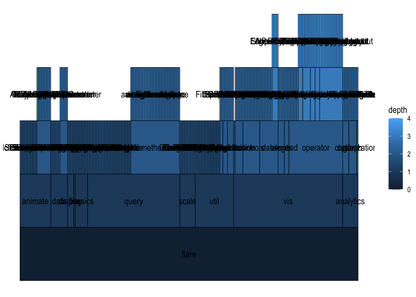
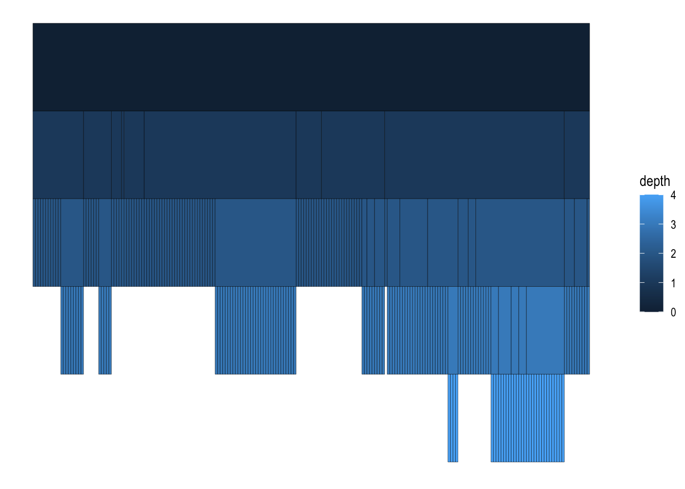
分区表
graph <- tbl_graph(flare$vertices, flare$edges)
# An icicle plot
ggraph(graph, 'partition') +
  geom_node_tile(aes(fill = depth), size = 0.25) +
  geom_node_text(aes(label=shortName))
## Warning: Using `size` aesthetic for lines was deprecated in ggplot2 3.4.0.
## ℹ Please use `linewidth` instead.
## This warning is displayed once every 8 hours.
## Call `lifecycle::last_lifecycle_warnings()` to see where this warning was
## generated.
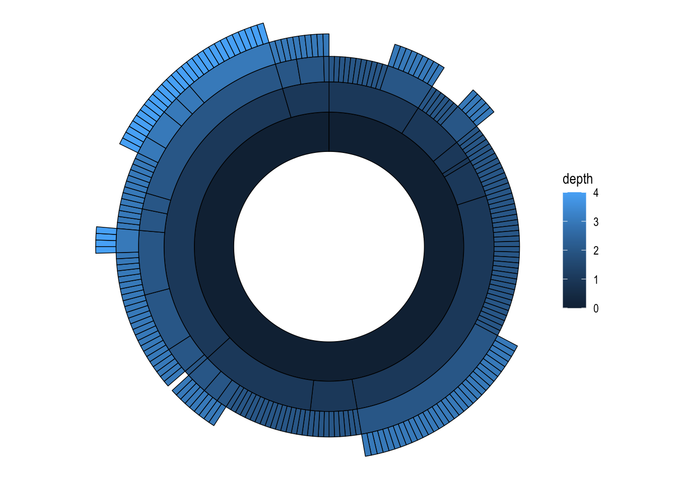
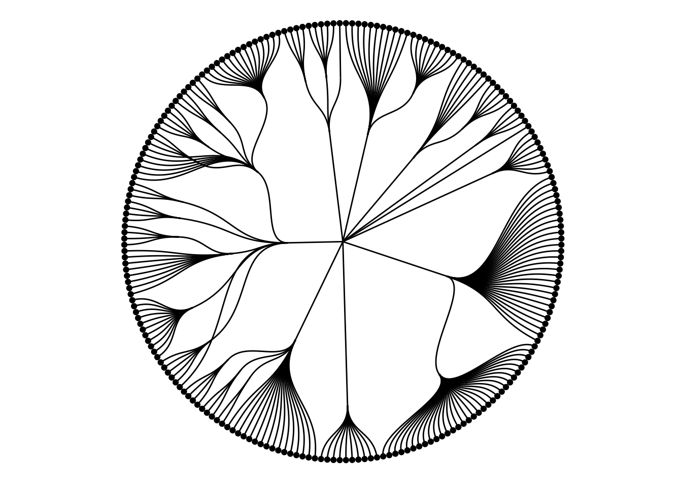
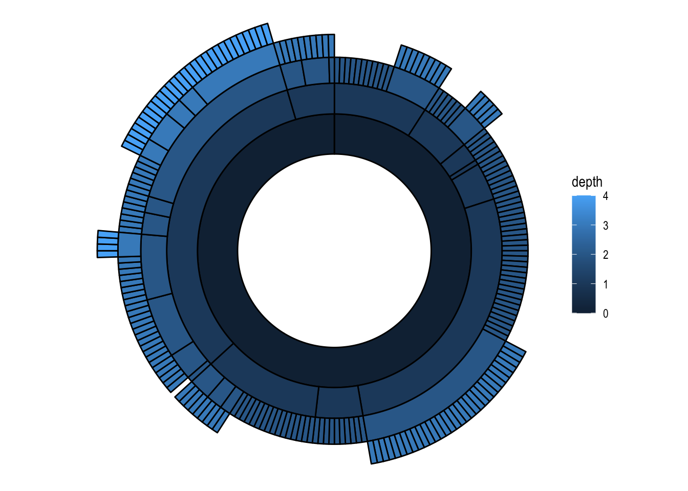
Sunburst plot
# A sunburst plot
ggraph(graph, 'partition', circular = TRUE) +
  geom_node_arc_bar(aes(fill = depth), size = 0.25) +
  coord_fixed()
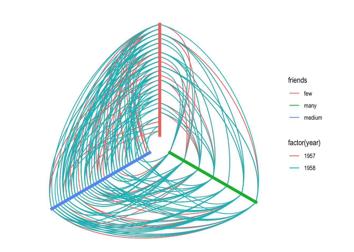
Hive plot
graph <- as_tbl_graph(highschool) %>%
  mutate(degree = centrality_degree())

graph <- graph %>%
  mutate(friends = ifelse(
    centrality_degree(mode = 'in') < 5, 'few',
    ifelse(centrality_degree(mode = 'in') >= 15, 'many', 'medium')
  ))
ggraph(graph, 'hive', axis = friends, sort.by = degree) +
  geom_edge_hive(aes(colour = factor(year))) +
  geom_axis_hive(aes(colour = friends), size = 2, label = FALSE) +
  coord_fixed()
Hierarchical layouts 分层布局
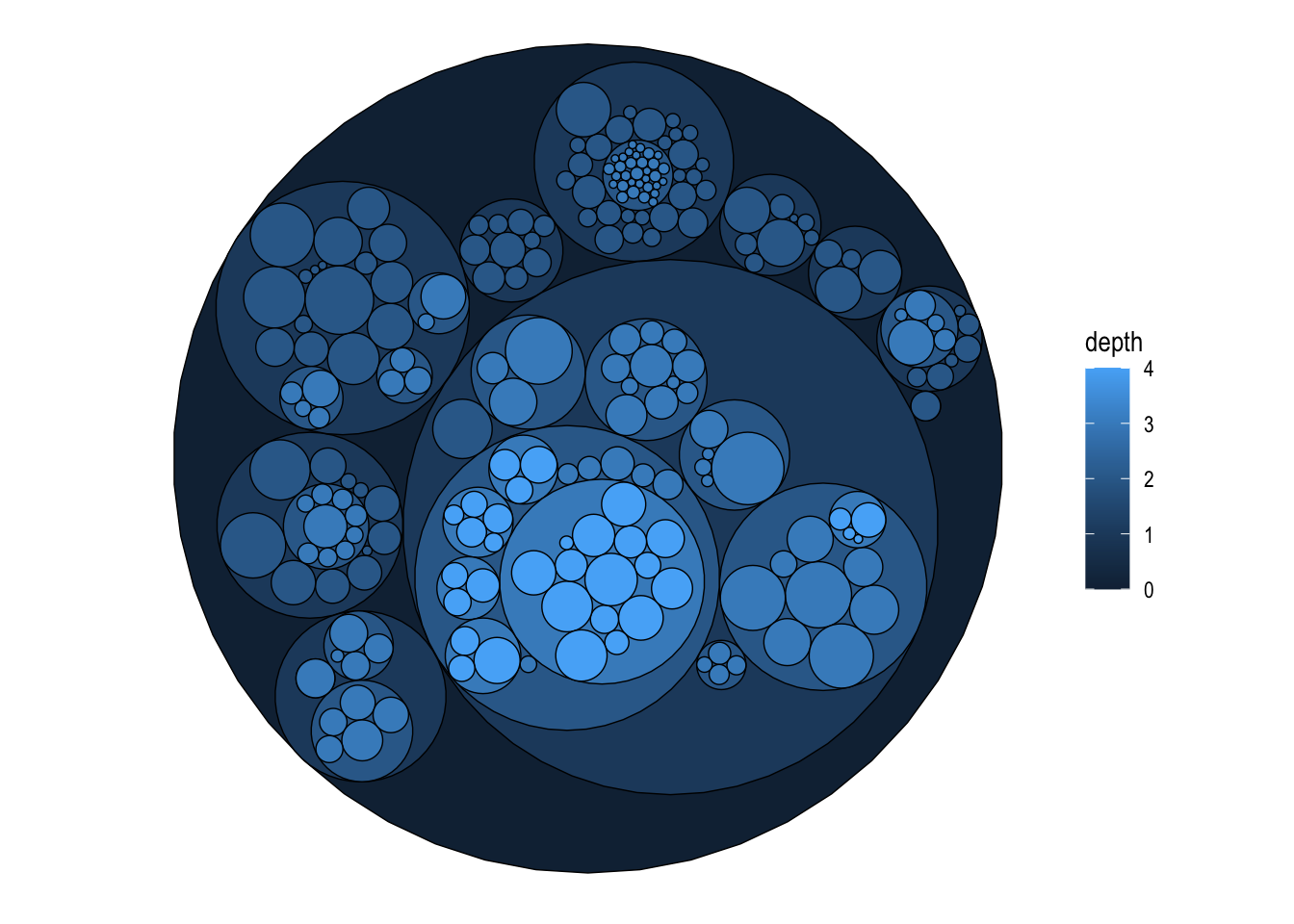
** 关于 flare 数据 **
This dataset contains the graph that describes the class hierarchy for the Flare ActionScript visualization library. It contains both the class hierarchy as well as the import connections between classes. This dataset has been used extensively in the D3.js documentation and examples and are included here to make it easy to redo the examples in ggraph.
graph <- tbl_graph(flare$vertices, flare$edges)
set.seed(1)
ggraph(graph, 'circlepack', weight = size) +
  geom_node_circle(aes(fill = depth), size = 0.25, n = 50) +
  coord_fixed()
set.seed(1)
ggraph(graph, 'circlepack', weight = size) +
  geom_edge_link() +
  geom_node_point(aes(colour = depth)) +
  coord_fixed()

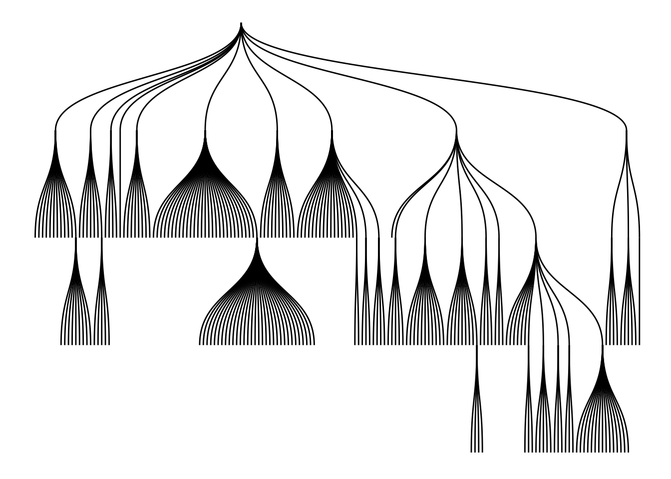
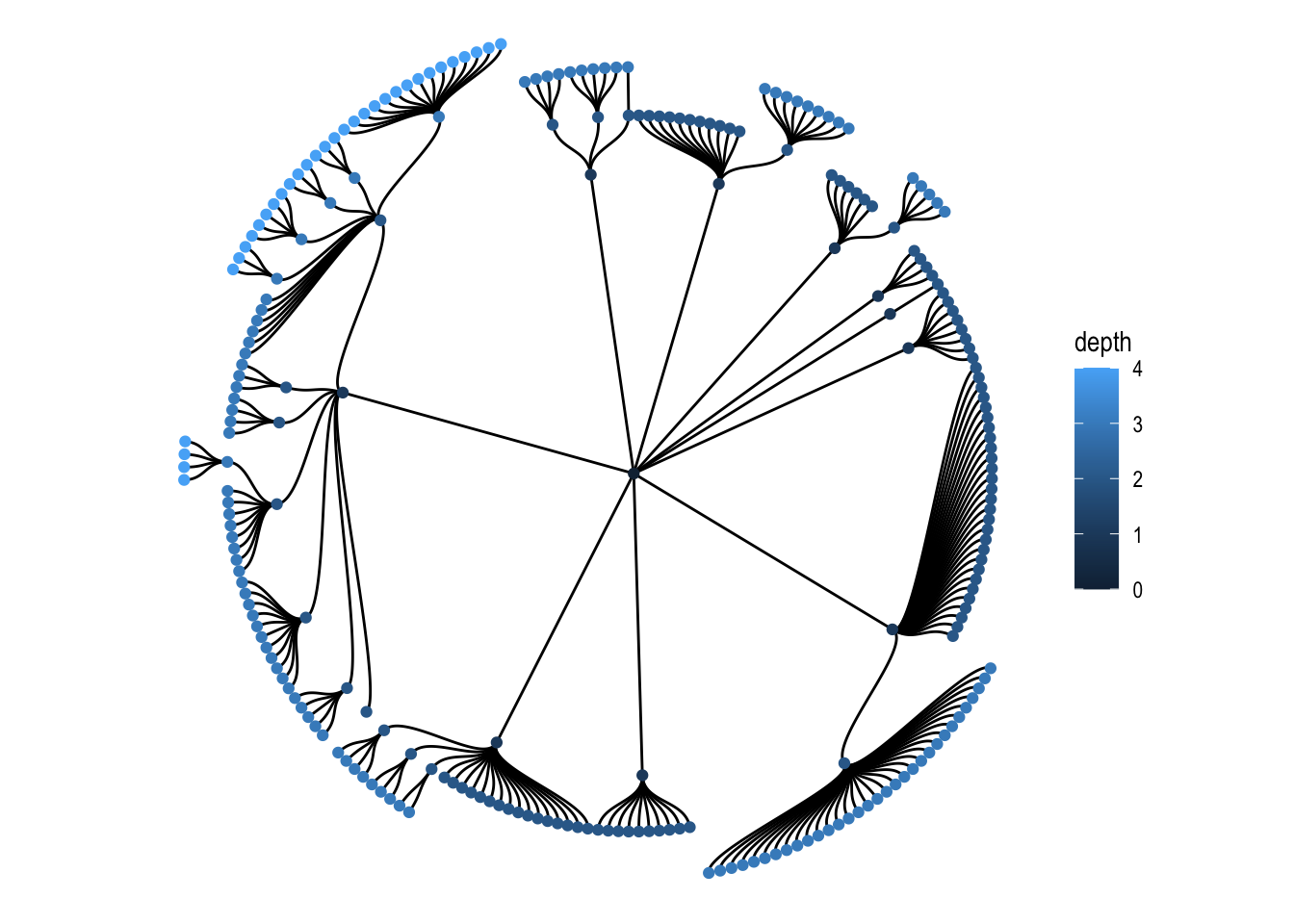
ggraph(graph, 'tree') +
  geom_edge_diagonal()
Matrix Layouts 矩阵布局
矩阵布局可以最大程度上减少边的遮盖。
graph <- create_notable('zachary')
ggraph(graph, 'matrix', sort.by = node_rank_leafsort()) +
  geom_edge_point(mirror = TRUE) +
  coord_fixed()
## Warning in .hclust_helper(x, control): control parameter method is deprecated.
## Use linkage instead!
Nodes 节点
Source:vignettes/Nodes.Rmd
节点不见得一定是点,也可以是片。
gr <- tbl_graph(flare$vertices, flare$edges)

ggraph(gr, layout = 'partition') +
  geom_node_tile(aes(y = -y, fill = depth))
通过对数据进行变换,可以控制上面的图 Y 数值取负数,以及下面的图 只显示叶片。
ggraph(gr, layout = 'dendrogram', circular = TRUE) +
  geom_edge_diagonal() +
  geom_node_point(aes(filter = leaf)) +
  coord_fixed()
最常用的节点 geoms 是 geom_node_point(), geom_node_text() 和 geom_node_label()。
geom_node_text() 和 geom_node_label() 从 ggrepel 包中取得了 repel 参数,当设为 True 的时候,可以避免文字遮盖。
此外,geom_node_voronio() 也提供了一种避免遮盖的方案。
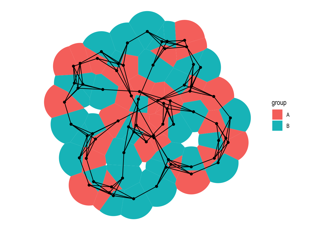
graph <- create_notable('meredith') %>%
  mutate(group = sample(c('A', 'B'), n(), TRUE))

ggraph(graph, 'stress') +
  geom_node_voronoi(aes(fill = group), max.radius = 1) +
  geom_node_point() +
  geom_edge_link() +
  coord_fixed()
还有一些其它的酷图。
l <- ggraph(gr, layout = 'partition', circular = TRUE)

## 分区表图
l + geom_node_arc_bar(aes(fill = depth)) +
  coord_fixed()
##
l + geom_edge_diagonal() +
  geom_node_point(aes(colour = depth)) +
  coord_fixed()
Edges
用作者的话说,“边不仅仅是两个点之间的一条线段”。ggraph 提供了系列函数来进行边的可视化。
首先,准备一下示例数据。
library(ggraph)
library(tidygraph)
library(purrr)
library(rlang)
## Warning: package 'rlang' was built under R version 4.3.3
##
## Attaching package: 'rlang'
## The following objects are masked from 'package:purrr':
##
##     %@%, flatten, flatten_chr, flatten_dbl, flatten_int, flatten_lgl,
##     flatten_raw, invoke, splice
set_graph_style(plot_margin = margin(1,1,1,1))
hierarchy <- as_tbl_graph(hclust(dist(iris[, 1:4]))) %>%
  mutate(Class = map_bfs_back_chr(node_is_root(), .f = function(node, path, ...) {
    if (leaf[node]) {
      as.character(iris$Species[as.integer(label[node])])
    } else {
      species <- unique(unlist(path$result))
      if (length(species) == 1) {
        species
      } else {
        NA_character_
      }
    }
  }))

hairball <- as_tbl_graph(highschool) %>%
  mutate(
    year_pop = map_local(mode = 'in', .f = function(neighborhood, ...) {
      neighborhood %E>% pull(year) %>% table() %>% sort(decreasing = TRUE)
    }),
    pop_devel = map_chr(year_pop, function(pop) {
      if (length(pop) == 0 || length(unique(pop)) == 1) return('unchanged')
      switch(names(pop)[which.max(pop)],
             '1957' = 'decreased',
             '1958' = 'increased')
    }),
    popularity = map_dbl(year_pop, ~ .[1]) %|% 0
  ) %>%
  activate(edges) %>%
  mutate(year = as.character(year))
常规类型
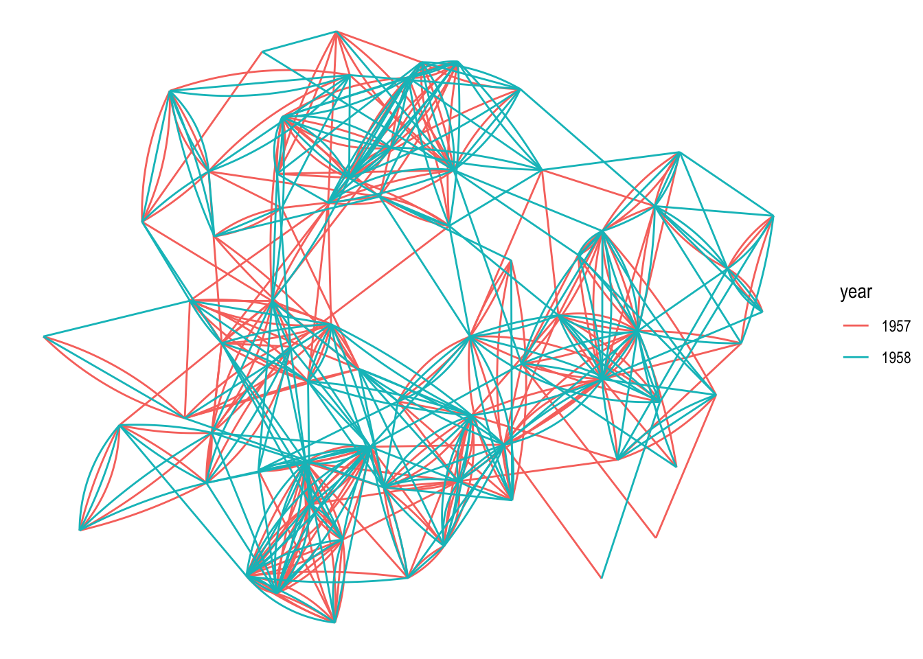
## 纺锤体
ggraph(hairball, layout = 'stress') +
  geom_edge_fan(aes(colour = year))
## 平行宇宙
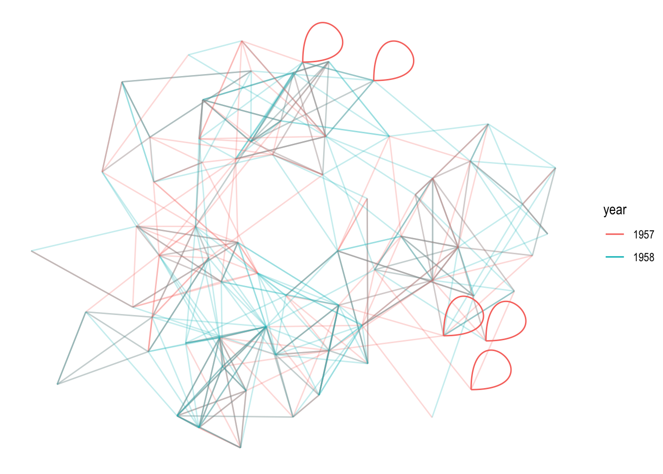
# let's make some of the student love themselves
loopy_hairball <- hairball %>%
bind_edges(tibble::tibble(from = 1:5, to = 1:5, year = rep('1957', 5)))
ggraph(loopy_hairball, layout = 'stress') +
geom_edge_link(aes(colour = year), alpha = 0.25) +
geom_edge_loop(aes(colour = year))
## 密度图
ggraph(hairball, layout = 'stress') +
  geom_edge_density(aes(fill = year)) +
  geom_edge_link(alpha = 0.25)
## Warning: The following aesthetics were dropped during statistical transformation: xend
## and yend.
## ℹ This can happen when ggplot fails to infer the correct grouping structure in
##   the data.
## ℹ Did you forget to specify a `group` aesthetic or to convert a numerical
##   variable into a factor?
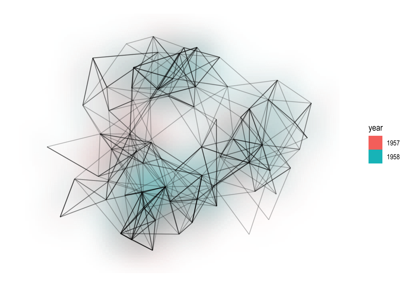
关于上面的密度图,可以显示边类型的密度。在上面的图中,如果 1957 年的居多,则显示为偏红色;如果 1958 年的居多,则显示为偏蓝色。
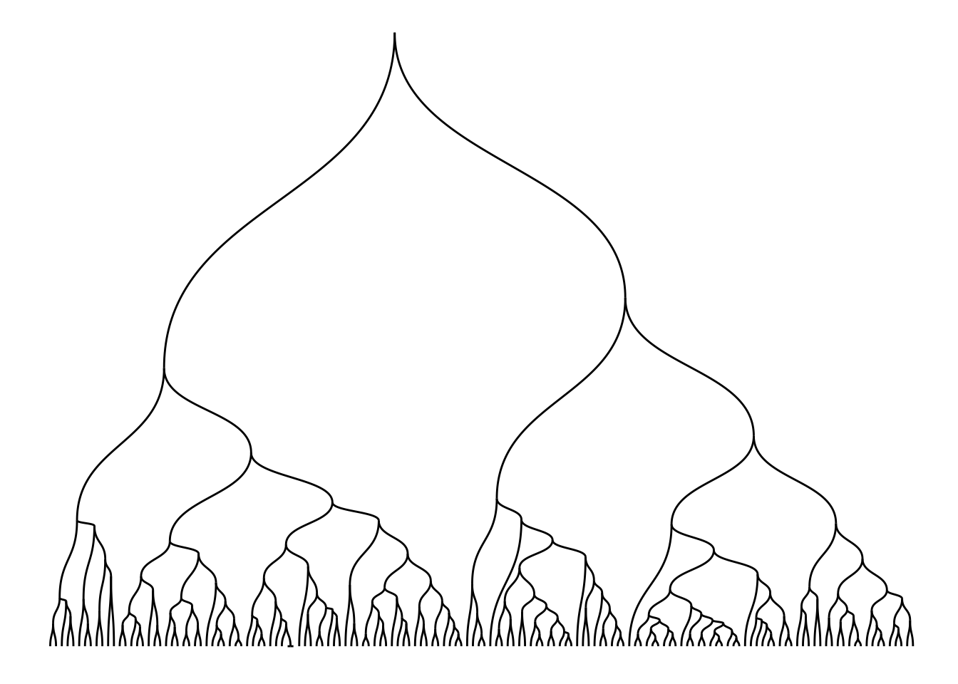
斜纹和对角线
## Diagonals
ggraph(hierarchy, layout = 'dendrogram', height = height) +
  geom_edge_diagonal()
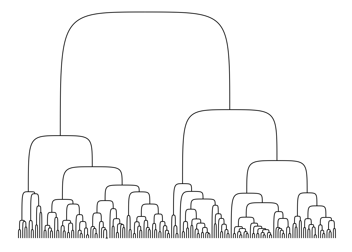
## Bends
ggraph(hierarchy, layout = 'dendrogram', height = height) +
  geom_edge_bend()
设定边的细节
- 使用箭头。
- 使用贝塞尔曲线
- 使用标签文字
Connections
Connections 不是边,但可以用来把 节点 连起来。
支持的数据类型
要生成一个图,需要的关系型数据在 R 中有很多形式。ggraph 是在 tidygraph 包的基础上开发的,后者大部分数据结构在 ggraph 中都是原生支持的。对于新的数据类型,要想获得 ggraph 的支持,只需要扩展支持一个 as_tbl_graph 方法即可。
相关包
ggdendro: supportdendrogram&hclustggtree: support tree-ralatedggnetwork:geomnet:GGally:
函数速查
详见:Reference
Plot Construction
ggraph()create_layout()
Layouts
布局在 ggraph() 中指定,或者通过 creat_layout() 计算。
layout_tbl_graph_auto()layout_tbl_graph_stress()layout_tbl_graph_backbone()layout_tbl_graph_*(), Others.
Nodes
-
geom_node_point()Show nodes as points
-
geom_node_text()geom_node_label()Annotate nodes with text
-
geom_node_tile()Draw the rectangles in a treemap
-
geom_node_voronoi()Show nodes as voronoi tiles
-
geom_node_circle()Show nodes as circles
-
geom_node_arc_bar()Show nodes as thick arcs
-
geom_node_range()Show nodes as a line spanning a horizontal range
Edges
-
geom_edge_link()geom_edge_link2()geom_edge_link0()Draw edges as straight lines between nodes
-
geom_edge_arc()geom_edge_arc2()geom_edge_arc0()Draw edges as Arcs
-
geom_edge_parallel()geom_edge_parallel2()geom_edge_parallel0()Draw multi edges as parallel lines
-
geom_edge_fan()geom_edge_fan2()geom_edge_fan0()Draw edges as curves of different curvature
-
geom_edge_loop()geom_edge_loop0()Draw edges as diagonals
-
geom_edge_diagonal()geom_edge_diagonal2()geom_edge_diagonal0()Draw edges as diagonals
-
geom_edge_elbow()geom_edge_elbow2()geom_edge_elbow0()Draw edges as elbows
-
geom_edge_bend()geom_edge_bend2()geom_edge_bend0()Draw edges as diagonals
-
geom_edge_hive()geom_edge_hive2()geom_edge_hive0()Draw edges in hive plots
-
geom_edge_span()geom_edge_span2()geom_edge_span0()Draw edges as vertical spans
-
geom_edge_point()Draw edges as glyphs
-
geom_edge_tile()Draw edges as glyphs
-
geom_edge_density()Show edges as a density map
Connections
Connections are meta-edges, connecting nodes that are not direct neighbors, either through their shortest path or directly.
-
geom_conn_bundle()geom_conn_bundle2()geom_conn_bundle0()Create hierarchical edge bundles between node connections
Facets
Faceting with networks is a bit different than for tabular data, as you’d often want to facet only nodes, or edges etc.
-
facet_graph()Create a grid of small multiples by node and/or edge attributes
-
facet_nodes()Create small multiples based on node attributes
-
facet_edges()Create small multiples based on edge attributes
Scales
While nodes uses the standard scales provided by ggplot2, edges have their own, allowing you to have different scaling for nodes and edges.
scale_edge_colour_*(): Edge colorscale_edge_fill_*(): Edge fillscale_edge_alpha*(): Edge alphascale_edge_width_*(): Edge widthscale_edge_size_*(): Edge sizescale_edge_lintype*():scale_edge_shape*()scale_label_size*(): Edge label size